
Content blocks are organised in the builder by Rows. While you may, of course, place all content in a single row, this strategy does not lend itself very well to a responsive design. Variable row structures allow for greater flexibility in content formatting and column distribution as well as overall design layout.
For example, you may need:
- A single-column row with a hero image introducing your online store’s new promotion.
- A three-column row below it, displaying your store’s best-selling products.
- Rows with different content and properties.
To add a new row to your design, select the Rows tab from the sidebar and drag the desired layout onto the stage.
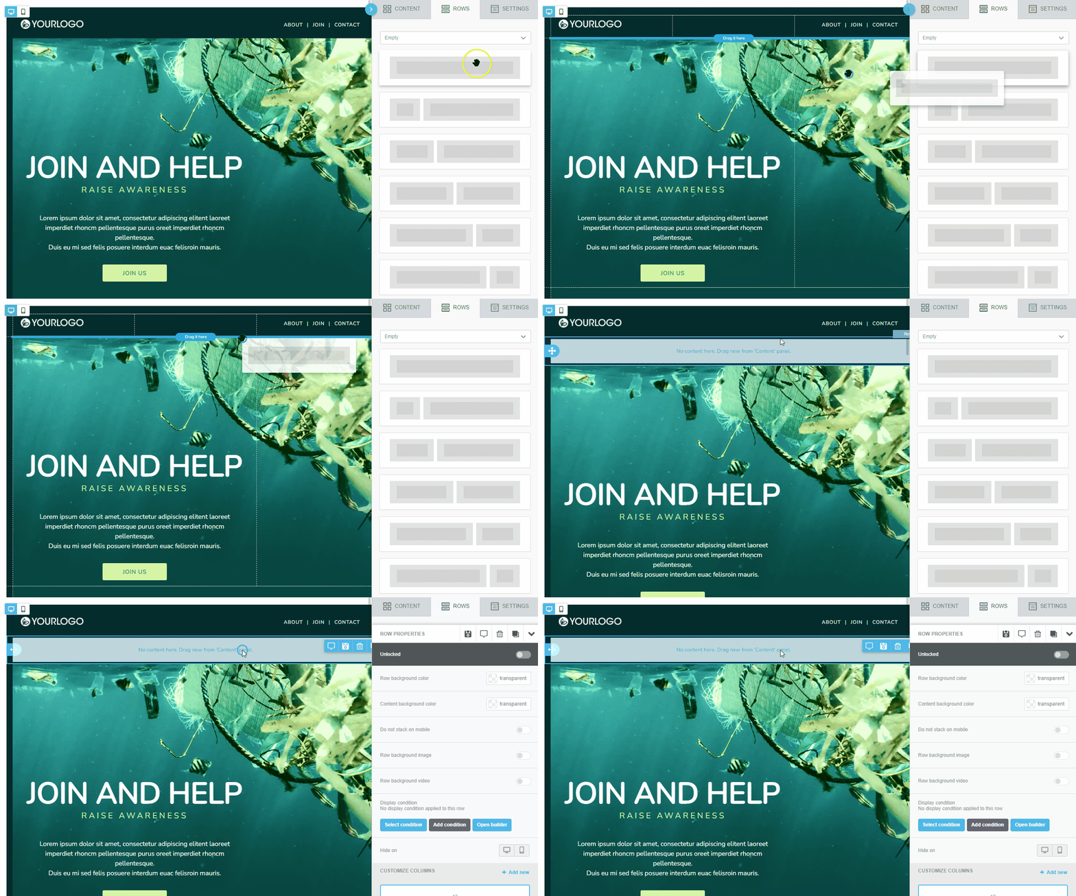
You may choose from:
- An Empty row with a pre-defined column layout.
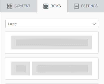
- A Default row pre-populated with content.
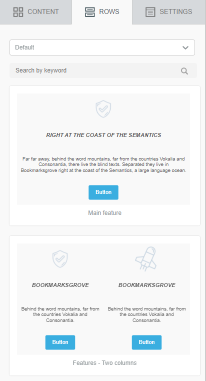
- A Saved row from another design.
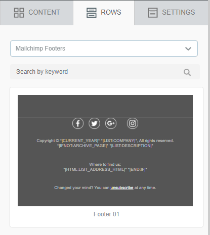
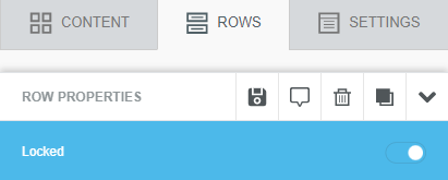
Once placed, you may lock the row to prevent other users from making changes to it.
Managing Rows
Once you place or select a Row on the stage, it will display highlighted with a drag handle and four icons as shown below.
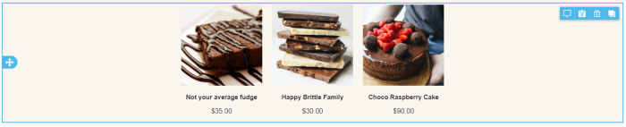
The displayed icons allow you to manage the block as follows:
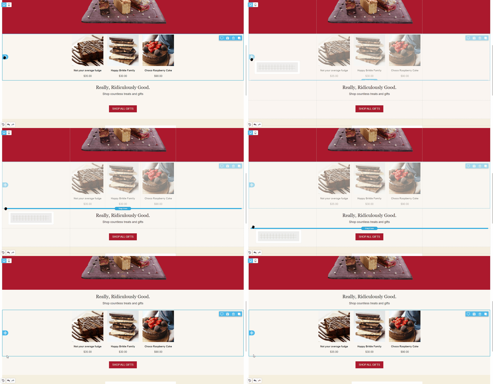
Move a Row
To move a row, click and hold the drag handle as shown below.
Comment on a Row

If this feature has been enabled by your administrator, this icon allows you to leave comments and view those made by other users.
Save a Row

This feature allows you to save a row for use in another design. The way that these rows are managed and retrieved will vary somewhat depending upon your implementation.
Clone a Row

This icon allows you to make a copy of a row. The new row will append directly beneath the original.